Our Blog

Balanced Scorecard Measurement + Control Charting Theory

Posted November 20, 2010 9:52 AM by Dylan Miyake

Control charts have long been used in manufacturing, stock trading algorithms, and in other process improvement methodologies like Six Sigma and Total Quality Management (TQM). The purpose of a control chart is to set upper and lower bounds of acceptable performance given normal variation. In other words, the control chart serves to "sound the alarm" when a process shifts (like a machine suddenly breaking on a factory floor) or if someone has a good breakthrough that needs to be documented and standardized across the larger organization. Here is an illustration: (citation) 
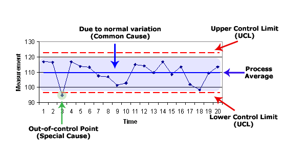
The Balanced Scorecard system typically uses a baseline, regular measurement and tracking against a target. Actual control charts might not be ideal for your Scorecard, however, the theory is still valuablewhen evaluating a measures behavior, either greatly up or down. Control charts at work – Examples: In industry, control charts are designed for speed: the faster the control charts respond following a process shift, the faster the engineers can identify the broken machine and return the system to producing quality products. At a factory, a lag in testing could mean that thousands of parts are produced incorrectly before anyone notices the machine is broken, resulting in wasted time, wasted materials, and angry customers. Similarly, at a non-profit organization, control charts could be used to determine when an online donation system has broken down or is receiving higher than normal usage, resulting in abnormal levels of donations. Should donations suddenly go to zero - the leadership team can quickly alert IT and ensure the system is brought back online. Alternatively, a major jump in donations means something good is happening- be it world events or a successful marketing campaign. Either way – leadership should know quickly when something is doing very well or very poorly compared to an average day. A government agency could use control charts to monitor security threats. Assuming there are between 15 and 30 threats per week, the agents know what to expect. One threat per week should be as alarming as should 75- as they both mean something is very abnormal. A school could use control charts to help evaluate attendance/absenteeism patterns. Let's assume, based on 2 years of analysis, that a school principal expects to see a certain level of student absences near holidays, with a typical range of 3% to 7% of students out. A control chart would plot along within the 3.1% to 6.9% range with no notice, but if 7.5% of students suddenly fail to show up for class, the lower control limit of 7% signals the alarm and the principal gets a call from attendance saying attention is required. Or conversely, if only 1% of students are absent, the upper control limit is surpassed, and the principal begins looking for reasons why the attendance is suddenly so much better than usual. Is there a pep rally or other event that motivates students to come to school at a time of year when they're more likely to be absent? Control Charts and the Balanced Scorecard Control charts can be used as part of the Balanced Scorecard approach to account for an acceptable range or variation of performance – it provides a more nuanced understanding of the organization's processes. There are a few key points to keep in mind when considering using control charts at your organization: Give it time Don't expect to see immediate results or instant insights from a control chart. It takes a number of months or years to understand natural variation and baseline "normal" performance (as the environment has some control on your measures and can distract from your own input). Watch for the "Big Movers" Control charts can help track and measure variation in a process over time. There is going to be a certain amount of variation as part of normal operations – small variation is nothing to worry about. Instead, focus your attention on major jumps or falls – these are the places where your organization needs to concentrate its efforts. Results matter – and results should be visible Process improvement initiatives should cause a metric to rise above the upper control limit – showing that there was a statistically significant shift in the objective's measure. Control charts give you a clear chance to see results and act on them – and if not, it might be time to try something new. Don't get bogged down. Control charts can be complicated – they were developed by engineers, after all! But your organization can keep your control charts as simple as you need them to be. Extremely complex math is still being developed in the operations research field to better understand process variation and how to account for it via control charts – but the typical leader at a service organization doesn't need to worry about going to that level of detail. Instead, try to identify the acceptable upper and lower limits for each key metric that you want to track, and keep the overall theory of limits in mind when reviewing your control charts. Develop an action plan for how to respond when the latest measure lands outside the acceptable limits. __ If you would like to learn more about how the Balanced Scorecard can help "chart" a path to success for your organization, please contact Ascendant Strategy Management Group.