
Why I Hate Averages
Laura Downing, one of our founding partners, knows that I have a serious thing against averages. Every time someone says "the average went up", or the "average went down" she looks over to see my face contort in horror. So what's the big deal with averages?
In short, averages hide the story behind the data.
Take the case of rainfall. If we took all the NOAA Weather Service data recorded at each station in the country for the past few years, added it all up, and then divided by the number of weather stations, we would have the "average" US rainfall.
It may look something like this- a nice steady chart with an average around 62 inches of rain per year.
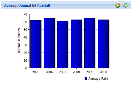
"Great," an observer might say, "we know the average, let's move on."
"Not so fast!" I retort. How do you explain the difference between these two images? They are both in the US but one is clearly getting more rain than the other.

And this is the heart of my distaste for averages. Sure, they are a valuable tool for getting a baseline perspective. But, they can also distort the story behind a measure.
In an ideal world, averages AND distributions should both be analyzed. So what is a distribution? Professional statisticians have all sorts of fancy algorithms and models, but I am simply talking about comparing each of the pieces of the average against each other. Only after understanding the underlying pieces can we understand what "the average" actually represents.
As an example, Wall Street salaries have been in the news quite a bit recently. What if you were to ask one of these firms to provide their "average salary"? They would do some quick calculations and be happy to report an average of something like $100,000. But the newspapers say they make millions, what happened?
Again, the story was lost in the average.
A simple average would say the firms combined salaries equaled $1.873 million. Averaged across 17 people, this equates to a measly $110,000, clearly very low for the risk and stress these poor bankers endure.
However, a closer examination might show the following information. There were 4 interns who made $2,500, then 2 couriers making $18,000, 2 landscapers making $21,000, 5 receptionists making $24,000, 3 Junior Partners making $55,000, and one Senior Partner making a whopping $1.5 million per year.
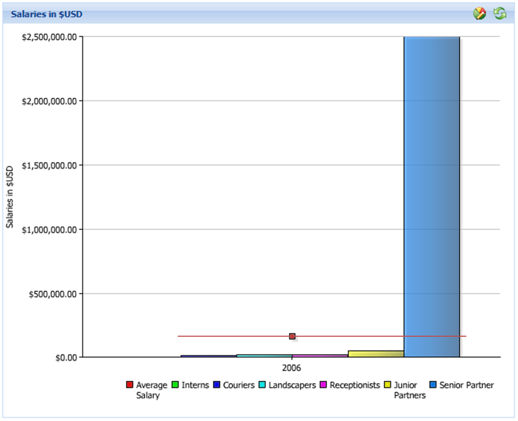
Distributions are simply a way of looking at the underlying data to see if the average is a good representation, or if the average is actually hiding a major outlier (the Senior Partner's Salary, in this case).
A quick glance at the chart above confirms "averaged salary" is neither a helpful nor informative measure.
Rather than saying the firm's averages salary is $100k per year (which is clearly false), a more accurate analysis might say that 13 of the employees make under $24k, while one single employee makes over a million bucks a year.
So, do I really hate averages? No. But they can be very deceiving. It is our job as data analysts and decision makers, to:
1. Understand the underlying data 2. Ensure "the average" is not oversimplifying a situation 3. And if the average is an oversimplification, we need to drill down and show an additional level of detail.


June 2021
| S | M | T | W | T | F | S |
|---|---|---|---|---|---|---|
| 1 | 2 | 3 | 4 | 5 | ||
| 6 | 7 | 8 | 9 | 10 | 11 | 12 |
| 13 | 14 | 15 | 16 | 17 | 18 | 19 |
| 20 | 21 | 22 | 23 | 24 | 25 | 26 |
| 27 | 28 | 29 | 30 |
Monthly Archive
June 2014 (1)
May 2014 (2)
March 2014 (1)
February 2014 (2)
January 2014 (1)
December 2013 (1)
October 2013 (2)
September 2013 (1)
July 2013 (2)
June 2013 (2)
April 2013 (1)
March 2013 (3)
February 2013 (4)
January 2013 (7)
December 2012 (4)
November 2012 (8)
October 2012 (9)
September 2012 (5)
August 2012 (6)
July 2012 (5)
June 2012 (7)
May 2012 (8)
April 2012 (5)
March 2012 (5)
February 2012 (6)
January 2012 (6)
December 2011 (7)
November 2011 (9)
October 2011 (9)
September 2011 (2)
August 2011 (8)
July 2011 (6)
June 2011 (8)
May 2011 (12)
April 2011 (5)
March 2011 (1)
February 2011 (2)
January 2011 (4)
December 2010 (6)
November 2010 (3)
October 2010 (5)
September 2010 (4)
August 2010 (3)
July 2010 (2)
June 2010 (1)
May 2010 (2)
April 2010 (1)
March 2010 (3)
January 2010 (4)
December 2009 (1)
November 2009 (1)
October 2009 (1)
September 2009 (3)
August 2009 (2)
July 2009 (3)
June 2009 (3)
May 2009 (6)
April 2009 (5)
March 2009 (3)
February 2009 (2)
January 2009 (2)
December 2008 (2)
November 2008 (2)
October 2008 (4)
September 2008 (6)
August 2008 (5)
July 2008 (4)
June 2008 (9)
May 2008 (5)
April 2008 (6)
March 2008 (8)